 Back to works
IKEA
Overview
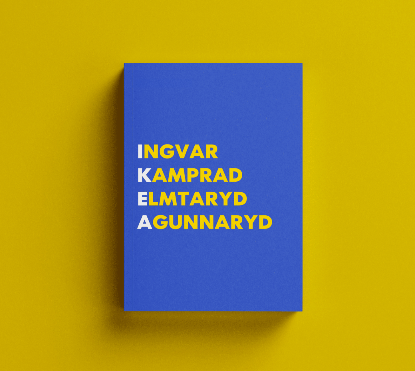
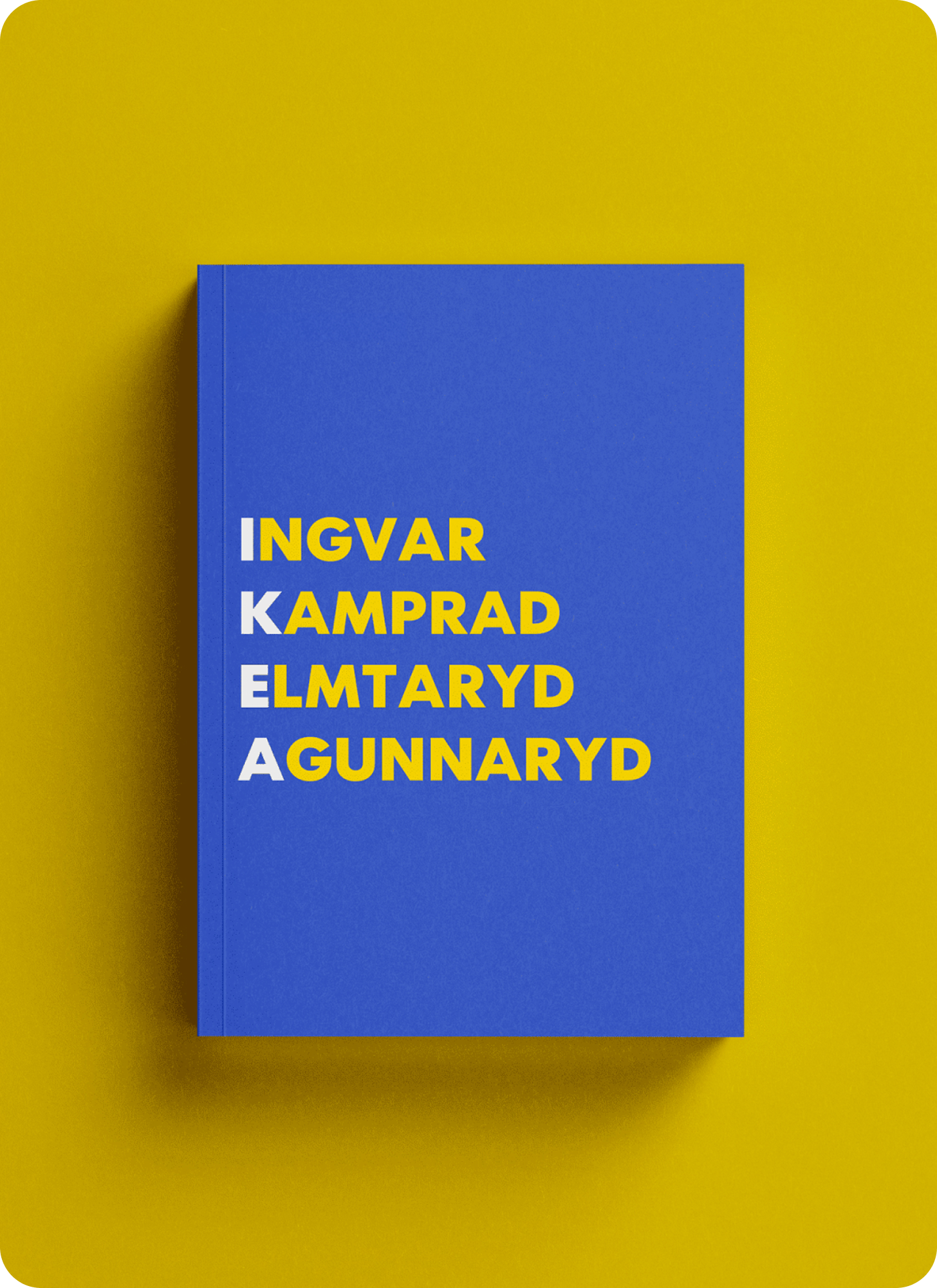
IKEA is an editorial design project exploring the brand’s origins, products and visual identity of one of the most furniture brand in the world. The publication brings those themes together through a reading experience shaped by typography, imagery and page layout.Project typeCollege’s Exam
FieldEditorial Design
Year2021
ToolsIn-Design
TURNING BRAND HISTORY INTO A BOOK
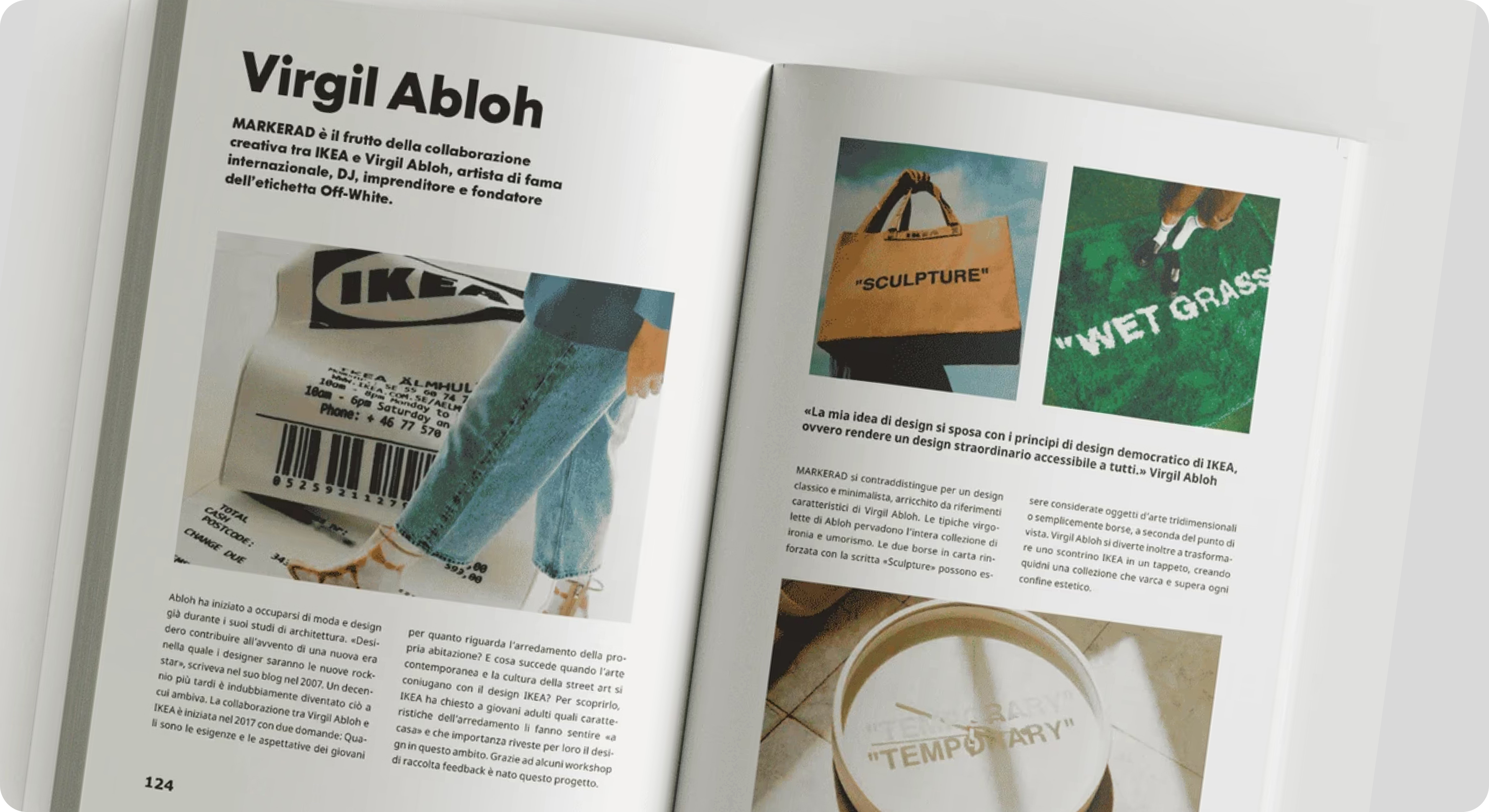
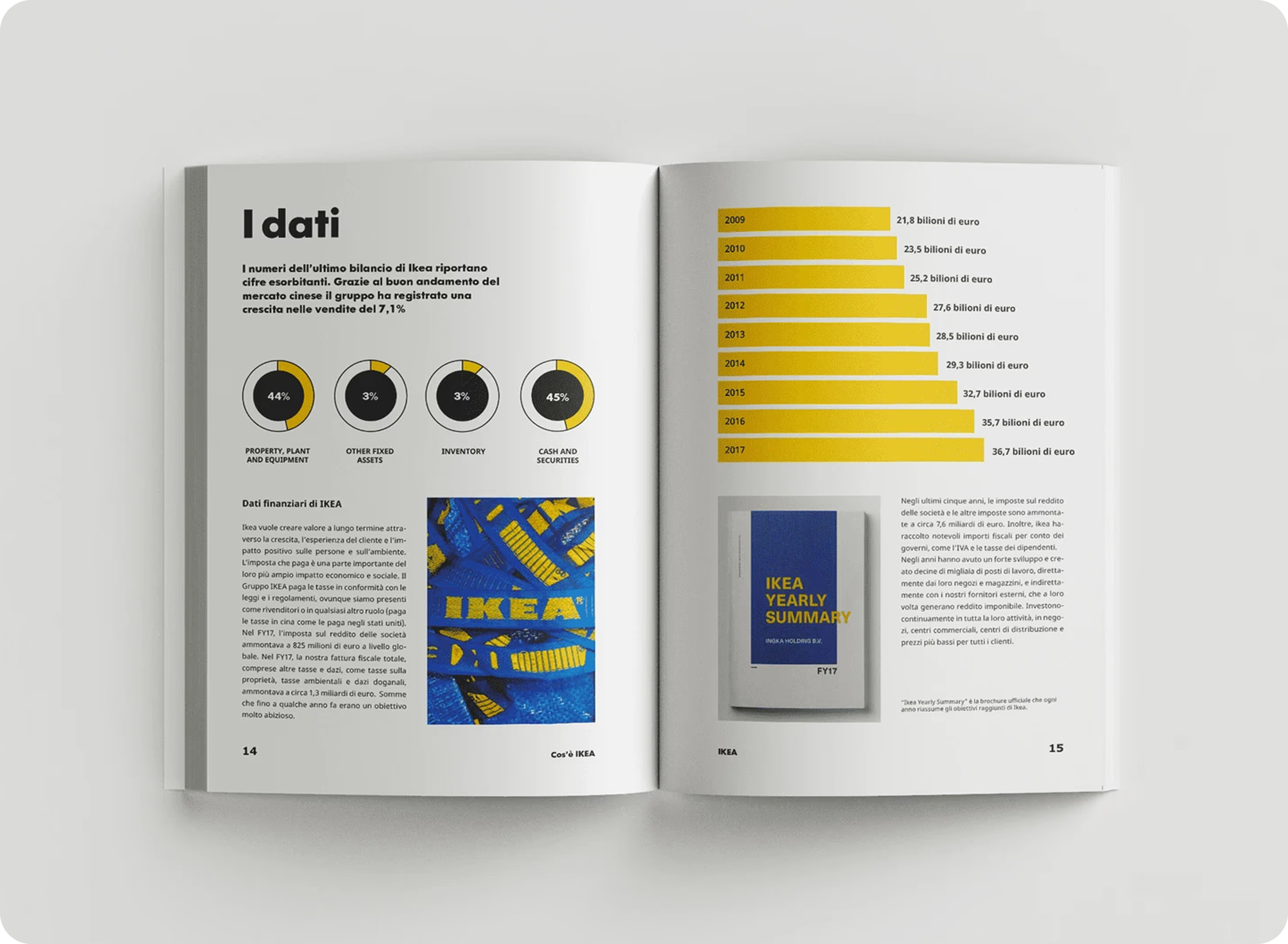
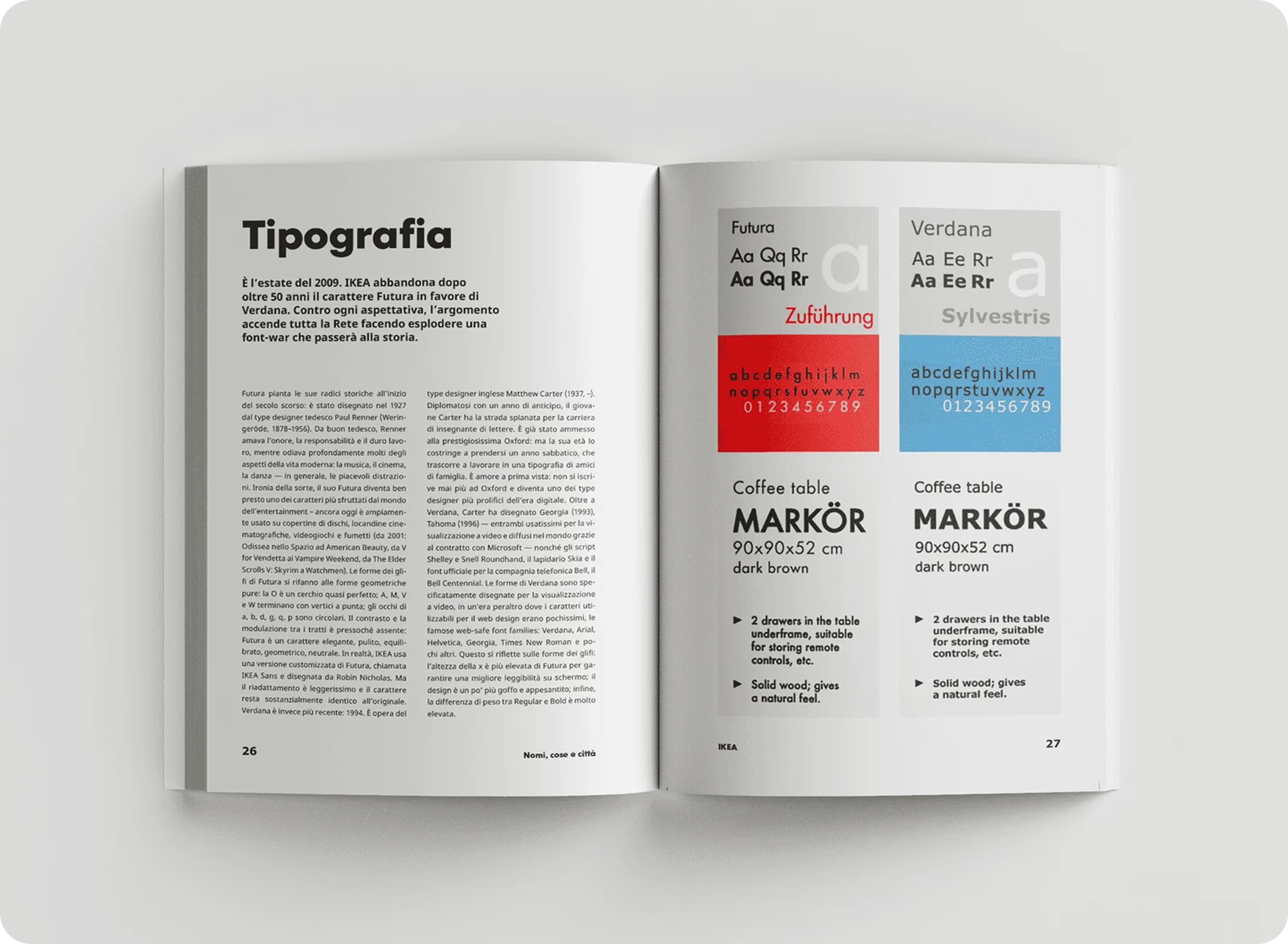
This project is a creative exploration of IKEA’s iconic design language, reimagined in an unofficial editorial format. The booklet merges minimalistic aesthetics with bold typography, vibrant imagery, and functional layouts that reflect IKEA’s brand ethos: simplicity, accessibility, and modernity.This unofficial booklet showcases my ability to interpret and elevate a brand’s visual identity into editorial formats, blending creativity with brand consistency to deliver a seamless user experience.
Download the full book →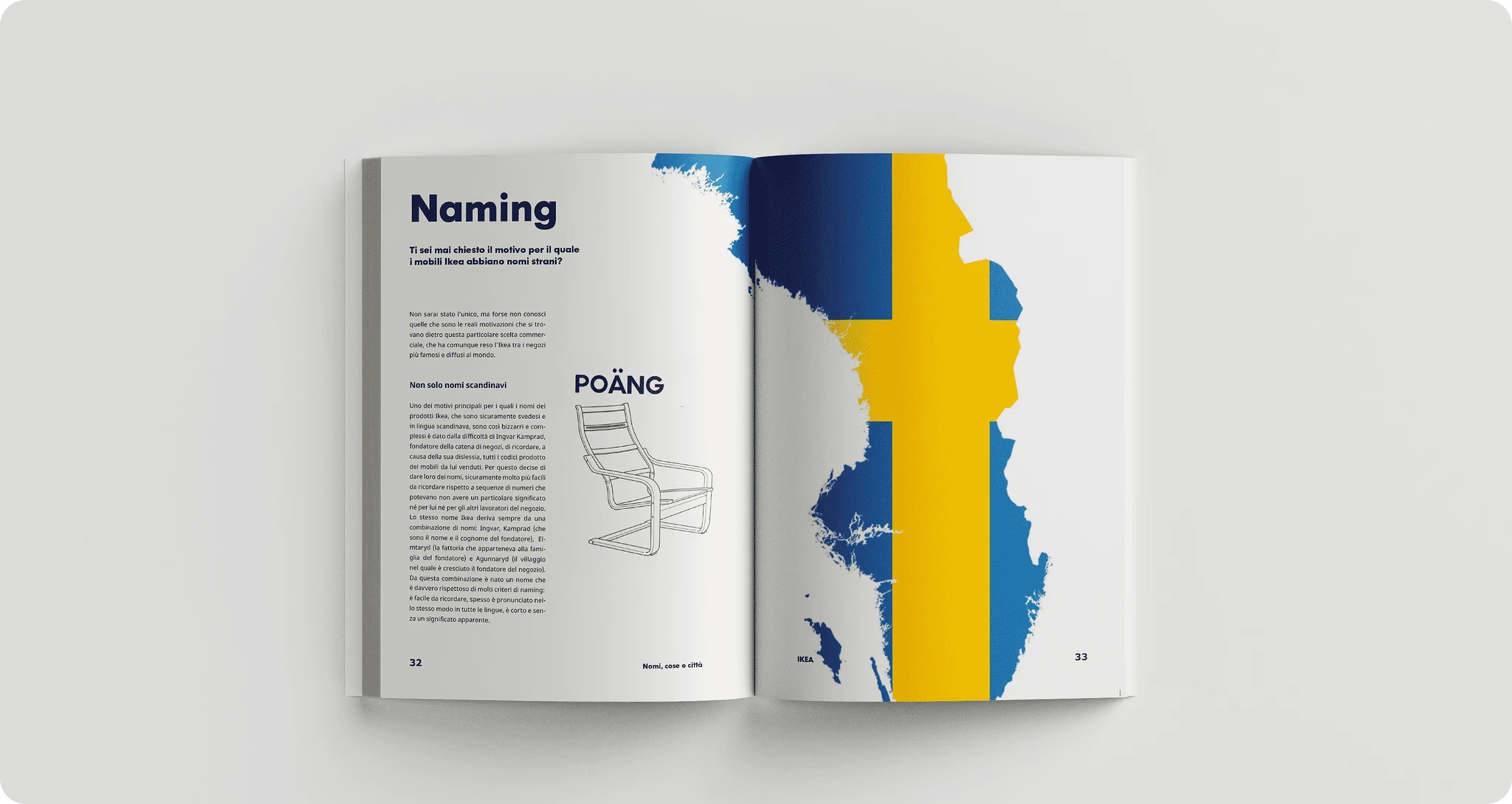
THE WORK
Introduce the visual system, key outputs or character studies shown below. This copy can also explain how the individual pieces belong to one coherent project.
DESIGNED FOR THE READER
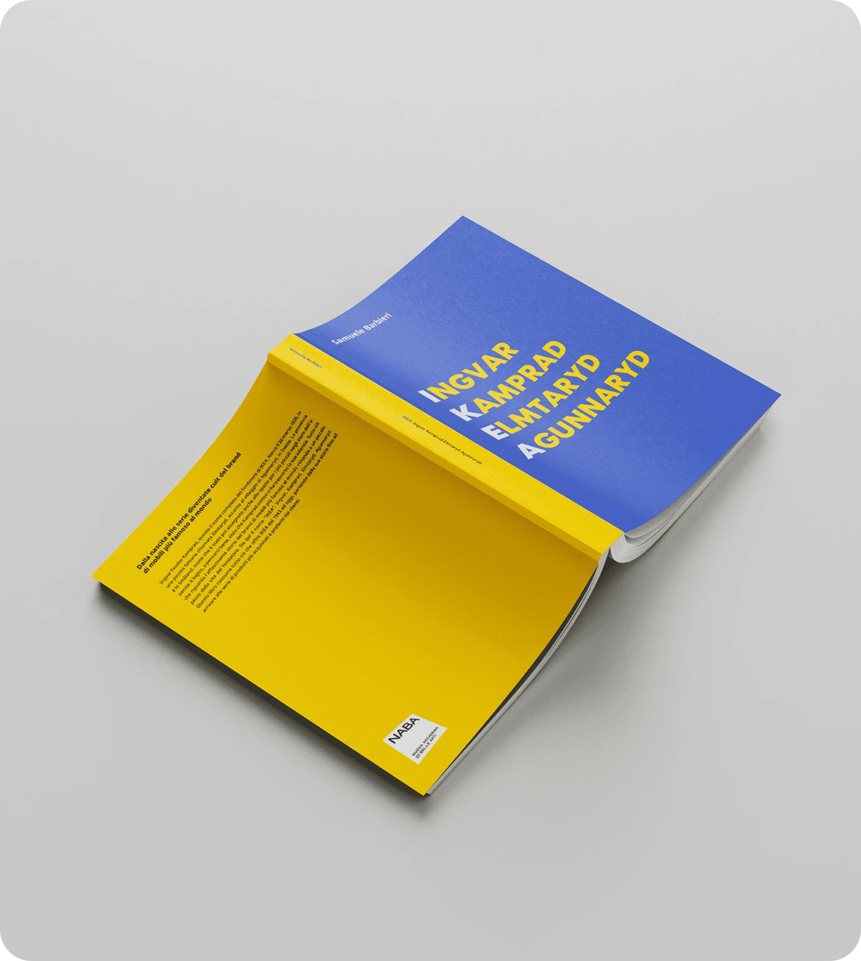
This project brought my interest in editorial design into print, as a physical book. It focuses on the decisions that make a publication work as a sequence: hierarchy, spacing and the balance between visual impact and comfortable reading.
Credits
Samuele Barbieri
